Statins Reduce Cholesterol But Not Heart Disease Progression

The notion that high cholesterol (more specifically, high “bad” — LDL — cholesterol) causes heart disease may be as widely accepted as the notion that humans have caused dangerous global warming. It is much easier to test, however. An excellent study published in 2006 compared two groups of people at risk for heart disease: those given a high dose of statins and those given a low dose. The high dose reducd LDL cholesterol levels; as it was meant to; the low dose did not. But there was no effect on coronary heart disease progression. After a year of statins, persons in both groups had increased their coronary artery calcification score by the same amount — about 25%. Totally contradicting the cholesterol hypothesis.

Regular readers of this blog may remember that after a year of eating butter (half a stick per day), my coronary artery calcification score decreased 24%. Because increases of about 25% are the norm, my score was about 50% less than expected. Decreases are very rare, I was told.

Thanks to Hyperlipid. Statin side effects.

Shangri-La Diet Success Story

On the Shangri-La Diet forums I found a link to this:
Weight Chart

A middle-aged man named Kainin has lost about 60 pounds since September (7 months) and described his experience in great detail. On Weight Watchers, he lost 40 pounds in 6 months before gaining it all back (plus 10 pounds more) — he started at 290, went down to 250, and back up to 300. On Nutrisystems, he lost 20 pounds in 6 weeks before gaining it all back. So the Shangri-La Diet has already helped him more than those two methods, not to mention being easier.

At the end of February, his BMI went below 35, the level indicating Morbid Obesity.

To celebrate I went to the local party store to look for a mylar balloon saying something like “Congratulations on being just Obese!” but found — NOTHING! The closest I found was a bereavement balloon that read “Sorry for your Loss”. Not exactly what I was looking for.

The roughly 100,000 posts on the SLD forums make the case for the diet far better than I ever could. Now, if I could just get rid of spammers …

Effect of Graphical Feedback on Productivity: Another Look

A few months ago, inspired by talking to Matthew Cornell, I started tracking when I was working. After a while I added graphical feedback like this:

The graph shows efficiency (time spent working/time available to work) versus time of day. The line shows the current day (not today, the current day when I made this graph). The higher the line, the better. When I work it goes up; when I take a break it goes down. The points are previous days. When the line is higher than the points, I am doing better than previous days. As I said in my first post, this seemed to help a lot: compare the green points (after graphical feedback) to the blue points (before graphical feedback). I blogged about possible explanations.

Here is more analysis. This graph shows efficiency versus day. Each point is the final efficiency (the efficiency after my last bout of work that day) for one day (the black and red points on the previous graph). These results suggest that the graphical feedback caused a sudden improvement, supporting the impression given by the blue/green (before/after) comparison of the earlier graph.

Before graphical feedback, the graph shows, efficiency was slowly increasing. Perhaps that was due to measuring when I was working, but I suspect it was due to the text feedback I got. I often used my tracking system to find out how long my current bout of work had lasted and how much I had worked so far that day. (For example, right now the text feedback is “15 minutes of blog, 73 minutes today”, which means I’ve spent 15 minutes writing this blog and before that worked 58 minutes on something else.)

Let me repeat what I said in another post: This was a big surprise. I collected this data for other reasons, which had nothing to do with graphical feedback. Before this project, I had made many thousands measurements of work time, but they were (a) tied to writing, not all work and (b) recorded inside the program I use for writing (Action Outline). Using R would have been slightly harder — that’s why I used Action Outline. I never studied the data, but I had the impression it helped.

You may know about the brain-damage patient H.M. His brain damage caused loss of long-term memory formation. He could remember something for a few minutes but not longer. The researcher working with him had to keep introducing herself. A pleasant side effect was that he could read the same thing again and again — a magazine article, for example — and enjoy it each time. This is like that. I am stupid enough that the results of my self-experimentation continue to surprise me (which I enjoy). You might think after many surprises I would stop being surprised — I would adjust my expectations — but somehow that doesn’t happen.

My Theory of Human Evolution: New Version

After a casual article, a talk, and many blog posts about my theory of human evolution, I managed to write a book chapter about it. Blogging helped. You may remember the ideas that language began because it increased trade and art began because it increased innovation. However, the center of the theory isn’t language and art, but procrastination. Above all, humans are the animals that specialize and trade. That’s obvious. Not obvious is that specialization begins with repetition — doing something over and over makes you an expert. The tendency to repeat had to be attachable to all sorts of activities, so that our ancient ancestors become expert at a wide range of things and could trade with each other. The mechanism behind this arbitrary repetition made it easy to repeat what you did yesterday and hard to do something new. Nowadays it does the same thing and thereby causes procrastination — difficulty starting something new.

The arbitrary day-after-day repetition began before trade. I believe it began when our ancestors were still hunting and gathering, like chimps. At some point there was a long-lasting surplus of food. The surplus lasted so long that it became beneficial to specialize while foraging. I suspect the great surplus was the discovery and exploitation of seafood, just as Elaine Morgan says, but what caused the abundance doesn’t matter for my theory. Specialization during foraging led to specialization during free time (hobbies). Trade began, part-time jobs (trading your specialty for necessities) began, and, when the pile of knowledge grew big enough, full-time jobs began.

The notion that repetition is behind expertise is supported by the idea that people who are really good at something have practiced a lot — say, 10,000 hours. I am saying two new things here: 1. Repetition is increased by hedonic changes: We want to repeat what we did yesterday. Doing something today makes it more pleasant to do tomorrow. 2. It’s not just superstars, such as the Beatles and Wayne Gretzky (Malcolm Gladwell’s examples), it’s everybody. Arbitrary repetition is behind Adam Smith’s “division of labour”. Our whole economy grew from a tendency to repeat today what you did yesterday.

How to Self-Experiment

At the upcoming QS Conference (May 28-9, San Jose), Robin Barooah and I will run a session about self-experimentation. Alexandra Carmichael asked me to write a post about how to do self-experimentation as a kind of advertisement for the session. Robin and I will be giving examples of what we have done and what we learned from them. Here’s some of what I’ve learned.

1. Easier to learn useful stuff than I expected. In contrast to the rest of life, where things turn out harder than expected, learning useful stuff by self-experimentation was always easier than I expected, in the sense that the benefit/cost ratio was unexpectedly high. I learned useful things I never expected to learn. An example is acne. When I was a grad student I had acne. My dermatologist had prescribed two drugs, tetracycline and benzoyl peroxide. I believed that the tetracycline worked and the benzoyl peroxide did not work. My results showed the opposite. It hadn’t occurred to me that I could be so wrong, nor that my dermatologist could be wrong (he believed both worked), nor that the establishment view (treat acne with tetracycline) could so easily be shown to be wrong.

2. Don’t be afraid of subjective measurements. By subjective measurements I mean non-physical measurements, such as ratings of mood or how rested I felt — what professional researchers call “self-report”. They routinely say self-report is misleading. At first, I wondered if my expectations and hopes would distort the measurements. As far as I can tell, that didn’t happen. Instead, I found such measurements helped me learn plenty of useful stuff I couldn’t have learned without it. For example, I learned how to improve my mood and how to wake up more rested.

3. Complex experimental designs were rarely worth the extra effort. Now and then I tried relatively complex experimental designs (e.g., randomization, a factorial experiment). Usually they were too hard.

4. Run conditions until you get 5-40 days of flat results (flat = what you are measuring is not going up or down). Ideal is 10-20 days. Suppose I want to compare Treatments A and B (e.g., different amounts of butter). I decide to make one measurement/day. The first step would be to do A for several days. I keep doing A until whatever I am measuring (e.g., sleep) stops steadily increasing or decreasing and then run several more days — ideally, 10-20. Then I do B for several days. I keep doing B until my measurement stops changing, then I do 10-20 more days of B. If the B measurements looked different from the A measurements, I would then return to Treatment A. It’s always a good idea to run a treatment until your central measurement stops changing, and then run it longer. How much longer? I’ve found that less than 5 days makes me nervous. Whereas running a condition for more than 40 days of flat results is a wasted opportunity to learn more by trying a different treatment.

5. Data analysis is easy. The most important thing is to plot measurement versus day. It will tell you most of what you want to know. For example, most of the graphs in this paper show whatever I was measuring (sleep, weight, etc.) as a function of day.

6. When you add data, look again at all the data. Each time I collect new data, I plot all of the data, or at least a large chunk of it. This helps spot unexpected changes. For example, each time I measure my weight I look at a plot of my weight over the last year or so. Recently I found that cold showers caused me to gain weight, which I hadn’t expected. If I hadn’t looked at a year of data every time I weighed myself, it would have taken longer to notice this.

7. Don’t adjust your set. My conclusions often contradicted expert opinion. Again and again, however, other data suggested my self-experimental conclusions were correct. Acne is one example. Later research supported my conclusion that tetracycline didn’t work. Another example is breakfast. Experts say breakfast is “the most important meal of the day.” I found it caused me to wake up too early. When I stopped eating it, my sleep got better. Other data supported my conclusion. The Shangri-La Diet is a third example. According to experts, it should never work. Hundreds of stories show it works at least some of time.

The most useful lesson I learned was the most basic. You will be tempted to do something complicated. Don’t. Do the simplest easiest thing that will tell you something. The world was always more complicated than I realized. Eventually it sank in: Complicated (experiment) plus complicated (world) = confusion. Simple (experiment) plus complicated (world) = progress.

Why Did Graphical Feedback Improve My Work Habits?

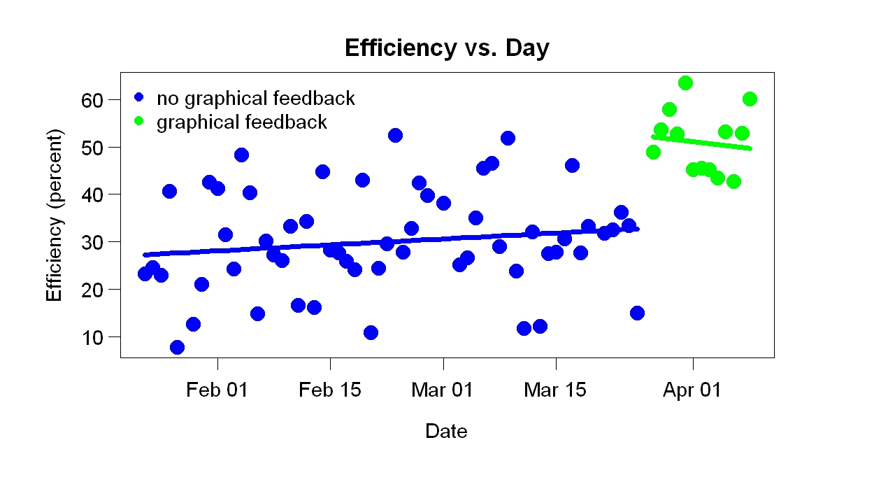
A few days ago I posted about the effect of efficiency graphs — graphs of time spent working/available time vs time of day (see below for an example). I used these graphs as feedback. They made it easy to see how my current efficiency compared to past days. As soon as I started looking at them (many times/day), my efficiency increased from about 25% to about 40%. I was surprised, you could even say shocked. Sure, I wanted to be more efficient but I had collected the data to test a quite different idea. In this post I will speculate about why the efficiency graphs helped.

Commenting on my post, a reader named Wayne suggested they helped for two reasons:

1. Motivation: You basically turned it into a contest with yourself by phrasing it as “today compared to previous days”. . .

2. Concreteness. . . . You were originally working with data in abstraction: what does “good” or “better” really mean, in realistic terms? . . . [Now] you can focus on the much more concrete: “am I doing better than in the past?”

This is a good guess. Before the graphical feedback, I had gotten plenty of non-graphical feedback: (a) how many minutes worked so far that day and (b) how many minutes during the current bout of work. Naturally I compared these numbers to previous days — certain total minutes per day and certain bout lengths were good, others were bad (e.g., working only 20 minutes before taking a break was bad, working 50 minutes before a break was good) — but I barely corrected for time of day. I vaguely knew that a certain amount by noon was good, for example. In other words, I did compare present to past, but vaguely.

Why were the efficiency graphs better than the text feedback? In addition to Wayne’s suggestions, I can think of other possible reasons:

1. Small improvements rewarded. When I was working, the line went up. Seeing this I thought good! — that is, I was rewarded. A good thing about this scheme is that it rewarded small improvements. A reward system that dispenses plenty of rewards (at the right times) will work better than a system that dispenses few of them.

2. Realistic goals. The goal — doing better than in the past — wasn’t hard to reach because the feedback was based on the whole previous distribution. I felt good if I was doing better than the median and even better the further from the median I was. This is more realistic than, say, dispensing reward only if I do better than ever before.

3. Pretty. The graphs are more attractive than a line of print (“40 minutes worked so far, 120 minutes so far today”) so I looked at them more often. Any feedback mechanism will work better if you pay more attention to it.

4. Loss aversion. Looking at the graphs caused a low-level pressure to work when I wasn’t working because I imagined the line going down. With previous feedback, loss was less obvious. With the previous feedback, if I didn’t work, minutes worked just didn’t increase; it did not go down.

5. Gentle pressure. When I didn’t work, my efficiency score went down slowly because it was based on the whole previous day, not just the last 10 minutes. This made the whole thing more sustainable.

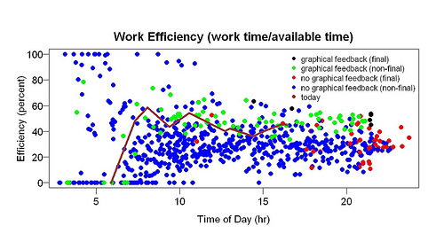
In hope of rewarding even smaller improvements, I added a number to the graph: the percentile of the current efficiency score to efficiency scores near the same time of day. Here is an example.

2011-04-04 more feedback

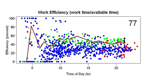
Each point is the start or end of a bout of work. Blue points = before graphical feedback, green points afterwards. The red and black points are the final points of the days. The brown line is the current day.

The large 77 in the upper right corner means 77th percentile, which means that the current efficiency score (shown by the end of the brown line) is in the 77th percentile compared to efficiencies measured within an hour of the same time of day. Let’s say the time was 9 pm. Then this percentile was computed using all scores (all the dots) between 8 and 10 pm. 77th percentile means that about 23% of the surrounding scores were higher, 77% lower.

The reason for this change is to make the feedback even more graded and realistic — even more sensitive to small improvements that are possible to make. My theory of human evolution says that art and decoration evolved because tools did a poor job of rewarding improvement. Until you could make the most primitive example of a tool, there was no reward for increased knowledge. The reward-vs.-knowledge function was close to a step function. Desire for art and decoration provided a more gradual reward-vs.-knowledge function. (I just finished a new write-up of that theory, which I will post soon.) . That’s what I am trying to do here.

Dangers of Antibiotics: Case Study

A column in The Telegraph by a doctor named James Le Fanu describes the following case:

It started eight years ago when he was laid low, while on holiday in Sri Lanka, by diarrhea. His symptoms cleared with antibiotics but he was left with a churning gut and frequent loud belching. This carried on for a couple of years until, listening to Farming Today, he heard an Australian vet talking about his belching sheep. “I got in touch and explained that I seemed to be behaving like one of his flock,” he writes. The vet suggested his bowel infection might have interfered with the gut enzymes for metabolising sugars, causing him to be intolerant of fructose. A test dose of orange juice immediately brought on his symptoms, and his gut problems settled on reducing his sugar intake.

In other words, no one consulted about this case, including the Australian vet and Dr. Le Fanu, seems to have understood that (a) a large fraction of our digestion is done by bacteria and (b) antibiotics kill bacteria. If you take antibiotics you risk digestive problems. I predict the belching would have gone away had he started eating fermented foods with bacteria that digest sugar. It was certainly worth a try.


Effect of Graphical Feedback on Productivity

After talking to Matthew Cornell a few months ago, I decided to try to measure how much time I worked. Measuring it might help me control it. I’d done this before but hadn’t gotten anywhere. Maybe this time . . .

I used R. It was easy to record when I worked. I work a while (e.g., 60 minutes), take a break (e.g., 30 minutes), go back to work, take another break, go back to work, take another break, and so on. The R programs I wrote recorded when each bout of work started and stopped. A typical day might have six bouts of work, interspersed with breaks. It was harder to write a program to show the data so I collected data for about eight weeks before I looked at it.

The display program I eventually wrote showed “efficiency” (total time spent working that day/available time that day) as a function of time of day. Each bout of work generated two points on the graph: one when it started, one when it ended. For each point, the efficiency of the whole day up to that point was computed. For example, if a bout of work started at 10 am, the efficiency for that time was how much work I had done before 10 am divided by how much time I had available before 10 am. Time available was computed from 3 am or when I woke up, whichever was later — as amusing/horrifying as that might sound. Suppose I woke up at 5 am. At 10 am, then, I had had 5 hours available to work. Suppose I had only worked between 8 am and 9 am. Then total work up to that point = 1 hour and efficiency = 20% (= 1/5). So I plot a point at (10 am, 20%). Suppose I work for an hour. End point: 11 am. Total work up to that point: 2 hours. Efficiency: 33% (= 2/6). That’s a point at (11 am, 33%).

Although I had collected the data to test an idea, I also thought it would be interesting to see how the current day compares to previous days. Was I doing better than usual? Worse than usual? To make this comparison I plotted the data from the current day as a line rather than as points, to make it stand out. I also made it a different color. I often ran the display program while working. It showed the results up to that moment.

All this had a surprising result: I became considerably more efficient. Here is an example of the graphs I looked at many times per day:

The brown line is the current day. The line goes up when I work, down during a break, up again when I resume working. Blue and green points are previous days. Blue points are from the days before I started looking at graphs like this, green points from the days after I started looking at graphs like this. In other words, the difference between the green and blue points shows the effect of looking at graphs like this. The red and black points are the final points of the day — red from the days before feedback, black from the days after feedback began. They summarize the day. The higher they are, the more efficient I was.

The green points are mostly above the blue points — and, especially, the black points are above the red points. This suggests that the graphical feedback made me more efficient. Before it began, I was about 25% efficient throughout the day. After this feedback began, I was about 40% efficient. The only change was addition of this feedback.

I was shocked by these results — the improvement was sudden and large. Had I an inkling that such a thing was possible, I would have tried it long ago. The comparison isn’t feedback vs. no feedback. Before the graphical feedback started I got printed feedback (“120 minutes [work] so far”) as often as I wanted and whenever I started or stopped work. And I’ve kept records of how much I work in other ways for a long time. My professional research area is animal learning — not far from studying the effect of feedback.

If the improvement persists, I will try to explain it. I once spoke to an engineering professor who started measuring his calorie intake, hoping to lose weight. As soon as he started keeping track, his once-a-week binges of eating a whole carton of ice cream in a sitting stopped. That’s the closest result I can think of and it isn’t that close.


Assorted Links

  • Interview with Peter Pronovost. “The pilot who neglects a checklist before take-off would not be allowed to fly, and most safe industries have transgressions that are firing offenses. … There hasn’t been that kind of accountability in health care. … Hospitals don’t pressure physicians about teamwork for fear of jeopardizing the business they bring to the hospital.”
  • Doctors taking kickbacks. Dr. William H. Resh, one of the accused doctors, defended himself like this: “I believe that it goes without saying that a doctor who agrees to consult with a company does so because of the confidence level they have in the company and the quality of its products.”
  • Advanced navel-gazing — nice article in Forbes about self-tracking.

Thanks to Brent Pottenger.