A few months ago, inspired by talking to Matthew Cornell, I started tracking when I was working. After a while I added graphical feedback like this:
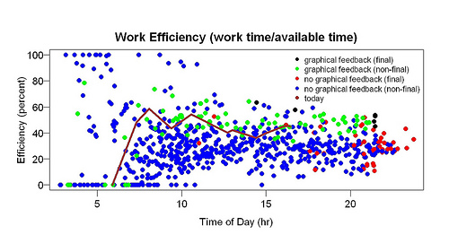
The graph shows efficiency (time spent working/time available to work) versus time of day. The line shows the current day (not today, the current day when I made this graph). The higher the line, the better. When I work it goes up; when I take a break it goes down. The points are previous days. When the line is higher than the points, I am doing better than previous days. As I said in my first post, this seemed to help a lot: compare the green points (after graphical feedback) to the blue points (before graphical feedback). I blogged about possible explanations.
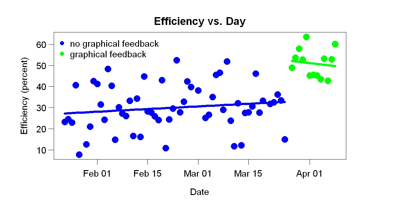
Here is more analysis. This graph shows efficiency versus day. Each point is the final efficiency (the efficiency after my last bout of work that day) for one day (the black and red points on the previous graph). These results suggest that the graphical feedback caused a sudden improvement, supporting the impression given by the blue/green (before/after) comparison of the earlier graph.
Before graphical feedback, the graph shows, efficiency was slowly increasing. Perhaps that was due to measuring when I was working, but I suspect it was due to the text feedback I got. I often used my tracking system to find out how long my current bout of work had lasted and how much I had worked so far that day. (For example, right now the text feedback is “15 minutes of blog, 73 minutes today”, which means I’ve spent 15 minutes writing this blog and before that worked 58 minutes on something else.)
Let me repeat what I said in another post: This was a big surprise. I collected this data for other reasons, which had nothing to do with graphical feedback. Before this project, I had made many thousands measurements of work time, but they were (a) tied to writing, not all work and (b) recorded inside the program I use for writing (Action Outline). Using R would have been slightly harder — that’s why I used Action Outline. I never studied the data, but I had the impression it helped.
You may know about the brain-damage patient H.M. His brain damage caused loss of long-term memory formation. He could remember something for a few minutes but not longer. The researcher working with him had to keep introducing herself. A pleasant side effect was that he could read the same thing again and again — a magazine article, for example — and enjoy it each time. This is like that. I am stupid enough that the results of my self-experimentation continue to surprise me (which I enjoy). You might think after many surprises I would stop being surprised — I would adjust my expectations — but somehow that doesn’t happen.
Do you manually record how much time you spend working? Is there a way to automate it?
I don’t think I could do what you did if manually recording is required because I would forget to do it. But if there was a way to automate it (like a computer program in the background), then it could be set up once and ignored until it was time to collect the data.
When I start a task I go to the R window and type something; when I stop doing a task, I go to the R window and type something. In that sense it is not fully automated.
This is tremendously important.
On top of that, it’s way bitchin’.
Interesting. I wonder if a more interactive or animated type of visual feedback could increase efficiency further or would reduce it by being too distracting.
If it were always present on my screen, that might make a difference. I don’t see what can be animated.