After talking to Matthew Cornell a few months ago, I decided to try to measure how much time I worked. Measuring it might help me control it. I’d done this before but hadn’t gotten anywhere. Maybe this time . . .
I used R. It was easy to record when I worked. I work a while (e.g., 60 minutes), take a break (e.g., 30 minutes), go back to work, take another break, go back to work, take another break, and so on. The R programs I wrote recorded when each bout of work started and stopped. A typical day might have six bouts of work, interspersed with breaks. It was harder to write a program to show the data so I collected data for about eight weeks before I looked at it.
The display program I eventually wrote showed “efficiency” (total time spent working that day/available time that day) as a function of time of day. Each bout of work generated two points on the graph: one when it started, one when it ended. For each point, the efficiency of the whole day up to that point was computed. For example, if a bout of work started at 10 am, the efficiency for that time was how much work I had done before 10 am divided by how much time I had available before 10 am. Time available was computed from 3 am or when I woke up, whichever was later — as amusing/horrifying as that might sound. Suppose I woke up at 5 am. At 10 am, then, I had had 5 hours available to work. Suppose I had only worked between 8 am and 9 am. Then total work up to that point = 1 hour and efficiency = 20% (= 1/5). So I plot a point at (10 am, 20%). Suppose I work for an hour. End point: 11 am. Total work up to that point: 2 hours. Efficiency: 33% (= 2/6). That’s a point at (11 am, 33%).
Although I had collected the data to test an idea, I also thought it would be interesting to see how the current day compares to previous days. Was I doing better than usual? Worse than usual? To make this comparison I plotted the data from the current day as a line rather than as points, to make it stand out. I also made it a different color. I often ran the display program while working. It showed the results up to that moment.
All this had a surprising result: I became considerably more efficient. Here is an example of the graphs I looked at many times per day:
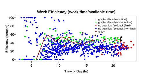
The brown line is the current day. The line goes up when I work, down during a break, up again when I resume working. Blue and green points are previous days. Blue points are from the days before I started looking at graphs like this, green points from the days after I started looking at graphs like this. In other words, the difference between the green and blue points shows the effect of looking at graphs like this. The red and black points are the final points of the day — red from the days before feedback, black from the days after feedback began. They summarize the day. The higher they are, the more efficient I was.
The green points are mostly above the blue points — and, especially, the black points are above the red points. This suggests that the graphical feedback made me more efficient. Before it began, I was about 25% efficient throughout the day. After this feedback began, I was about 40% efficient. The only change was addition of this feedback.
I was shocked by these results — the improvement was sudden and large. Had I an inkling that such a thing was possible, I would have tried it long ago. The comparison isn’t feedback vs. no feedback. Before the graphical feedback started I got printed feedback (“120 minutes [work] so far”) as often as I wanted and whenever I started or stopped work. And I’ve kept records of how much I work in other ways for a long time. My professional research area is animal learning — not far from studying the effect of feedback.
If the improvement persists, I will try to explain it. I once spoke to an engineering professor who started measuring his calorie intake, hoping to lose weight. As soon as he started keeping track, his once-a-week binges of eating a whole carton of ice cream in a sitting stopped. That’s the closest result I can think of and it isn’t that close.
Can this not be explained by the Hawthorne effect?
“The Hawthorne effect is a form of reactivity whereby subjects improve or modify an aspect of their behavior being experimentally measured simply in response to the fact that they are being studied, not in response to any particular experimental manipulation.”
Now THIS is why I read you.
I REALLY want that program.
I think the program is the big breakthrough, not the insight that continual graphical tracking increases productivity. Although the fact that you quantified it is impressive.
I’ve been doing this on a cludgy basis, on and off.
PLEASE share the program. I will learn R. I don’t care.
Read it again SB, no it can’t.
This is about Continuous Graphical Feedback.
All 3 elements. Non reducible.
SB, I was already measuring my behavior when I started this graphical feedback. The measurement started two months earlier. So the improvement cannot be due to the measurement. The improvement must be due to some details of the feedback, and I cannot easily say what those details are.
For a behavioral econ take on this….
https://faculty.chicagobooth.edu/christopher.hsee/vita/papers/mediummaximization.pdf
I saw a response on a blog from someone who simply began weighing themselves every morning. They wanted to see if simple observation caused them to lose weight. They lost a substantial amount of weight in a reasonable period of time. Obviously it wasn’t watching that did the trick, it was some unmonitored path between that and their eating and activity choices (which they did not consciously change). But in any case, just knowing the state and trend made a difference.
this is *fantastic*
Love this post. Agree w/ Joseph Dantes. Some additional questions:
1) How did the program “know” whether you were working or not? Did you have some kind of “clock in/clock out” thing? Just hit return when you started working, return again when you stop, or start to goof off?
2) What counts as ‘work?’ This is my damn problem. Start out doing something that is absolutely, positively work (I had decided that x needs to be built, so if I am actually building x then that’s work). Get into a grey area (doing background reading on something that’s keeping me from making progress on x). Drift into something that’s probably not work (researching something peripheral to x, that might be important later, or important for something that comes after I finish x) to something that’s definitely not-work. Seems like you might have some of these same issues — how did you deal with them?
Not that surprising. More intense feedback is better feedback.
I would guess the actual causal path is that a printed word form limits the computation to rational consciousness (highly abstract) but a graphical form can be understood by the subconscious, which would allow you to rope more of your brain into understanding and pursuing the goal of working more efficiently.
In me the transition is marked by the issue changing from an airy feeling to a solid and broad gut-level response. If I can get this gut response to a goal, it can mean the difference between being impossible and being unavoidable.
Thanks, wr.
How did the program know I was working? When I started working I ran a program called work.start that recorded a few things. When I stopped working I ran a program called work.stop. Since R is always open this was easy.
What counted as work? I have a broad definition: Making tea while working is work. When answering email (which is work), reading links people send me counts, even though I enjoy that. Although I enjoy writing my blog, that too is work. Also included is standard work: writing scientific papers, for example. You can think of my definition like this: ordinary work plus stuff I have to do and want to spend more time doing (e.g., email).
“More intense feedback is better feedback.” I doubt that intensity is the only important thing I changed. Perhaps the feedback was effective because progress was easy to see. It was easy to see because of the detailed comparison to previous days. I didn’t just show the average of previous days. From looking at the data I could see my percentile compared to previous days. Was I better than 60% of previous days? 80%? 99%? Right/wrong feedback isn’t like that.
If I’m reading you correctly, I see two differences:
1. Motivation: you basically turned it into a contest with yourself by phrasing it as “today compared to previous days”. That probably draws on various emotional reserves and helps push through tedium.
2. Concreteness. I’m finding it hard to put it into words, but it seems to me that you were originally working with data in abstraction: what does “good” or “better” really mean, in realistic terms? A rough eyeball of your blue data says 40% efficiency was probably average, so does that make 50% good? Is 90% sustainable?
Once you focused your comparison to “how am I doing compared to yesterday?” the actual scale (50%, 40%, 90%) and “what is good?” don’t really matter anymore since you can focus on the much more concrete: “am I doing better than in the past?”
Does that make sense?
I would also guess that the reframing of your data and what it means probably affected what you called “work”. Before, it was abstract data: points in a cloud. Now it was an attempt to do better than you had before, so perhaps you were subconsciously more generous with what you tagged as work. You were competing with “them” (you, actually), and perhaps became a bit more of a “rules lawyer” who was m ore likely to call something work.
The lean quality people hold the use of simple visual feedback mechanisms as a fundamental principle of quality and efficiency. I’ve seen some of them recommend use of a simple magnetic whiteboard in place of an ERP computer system for some surprisingly large organizations, for reasons like the one you are describing.
“Agile” software development also rejects complex project management software in favor of post it notes, whiteboards, and poster sized hand drawn graphs.
Possibly part of the effect is due to you having chosen and created the visual feedback yourself? For instance, if you mandated my the use of your R program and graph at work, would it work as well?
Also, you defined efficiency as sitting at your computer? That probably wouldn’t work in all cases, for instance, like me. Look what I’m doing right now…….
Darrin, I agree with the point about visual feedback but not about the “simple”. This feedback isn’t so simple: see all the points. Nor is my attempted improvement (see today’s post) where I compute a percentile. I think part of the reason this works is that there is comparison of the current score against the whole distribution of past scores, not against some simple summary.
Does it work because I created it myself? Yeah, to the extent that it is tailored for just my situation.
Do I “cheat” on what I call working? No more now than before the graphical feedback started. I learned long ago that it was a good idea to count making tea as work.
Interesting. Off-and-on I use an application called “Time Rescue” to monitor my activities / efficiency on-line.. to try to manage how I balance content consumption with production and also other wasteful activities (messenger apps, etc.).
If you have any suggestions on better applications I’d love to hear them!
Thanks,
Eugenio
I fully support Joseph Dantes idea: I guess many people would appreciate advice on how to build something like this for themselves. Probably not that intersting for the author but such practical postings could have a big impact on ordinary readers’ lifes. Some hints for the reader with basic knowledge of statistical software would probably suffice.
Hey Seth, this was a fascinating post. It strikes me that what you found is kind of like the opposite of the Shangri La diet! In the SLD, you claim it is the explicit pairing of calories with flavors that contributes to increases in weight set point (or some correlate thereof). To reverse that you unpair calories from flavor. In the current experiment, work and visual feedback of productivity are typically unpaired, but you found a way to pair them and therefore allow visual feedback to reinforce productivity! Cool.
As an aside, I wouldn’t characterize my activities as work versus non work (or play or rest or whatever other term for “non work” you may wish to use). Instead, I categorize my activities into productivity and inductivity. I’m being inductive when I’m not actually being productive. I think this is not merely a means of making myself feel better about time spent in non-productive activities, but actually acknowledges the value of these non-productive times as contributors to the eventual results of my productive times. I tend to think Nassim Taleb would agree, and just as eating and exercise follow power law functions, so does productivity. One can think of pounding away at the keyboard writing a paper or other productive efforts as being like chronic cardio (to lift Mark Sisson’s term). I’d rather intersperse long periods of inductivity with brief and intense bouts of productivity. Just like I prefer long periods of restful or slow activity (walking, lounging, etc.) punctuated by brief and intense bursts of activity (sprinting, lifting heavy things, etc.).
Aaron, yes, I agree, it is something like using ideas about associative learning for practical purposes. Perhaps the feedback, by rewarding work, made it more likely. Or perhaps it punished not working.
If work is like exercise, what is the equivalent of walking? of sprinting? Perhaps sprinting = work that requires a lot of concentration, but then walking = work that doesn’t require much concentration. The analogy suggests people should spend plenty of time doing work that doesn’t require much concentration, just as they should spend hours/day walking. But where work is concerned I think the power-law idea leaves out something important: we like doing stuff we have done the day before. So repetition is crucial. It is important to do stuff day after day. Then it will keep being easy and pleasant to do. Stop doing it for several days and it will become difficult to do. The best feature of this productivity graph is that it encourages me to do stuff day after day.
sdz, that is a good point. After I’ve been using it long enough to fix problems, be sure it works, and so on, I’ll consider writing a version that people can download. So if you are willing to install R you can try it.