
Here is another example of the efficiency graphs I’ve blogged about (here, here and here). The line is the current day; it shows how well I’m doing compared to previous days. It goes up when I work, down during breaks. The number in the right corner (“77″) is the percentile of my current efficiency (at the time the graph is made) compared to measurements within one hour (e.g., a measurement at 2 pm is compared to previous measurements between 1 pm and 3 pm).
The blue points come from before I started the feedback; the green points, afterwards. The red and black points are the final points of a day (that is, at quitting time). That the green points are above the blue points suggests that the graphical feedback helped. Here is a better way of seeing the effect of the feedback.
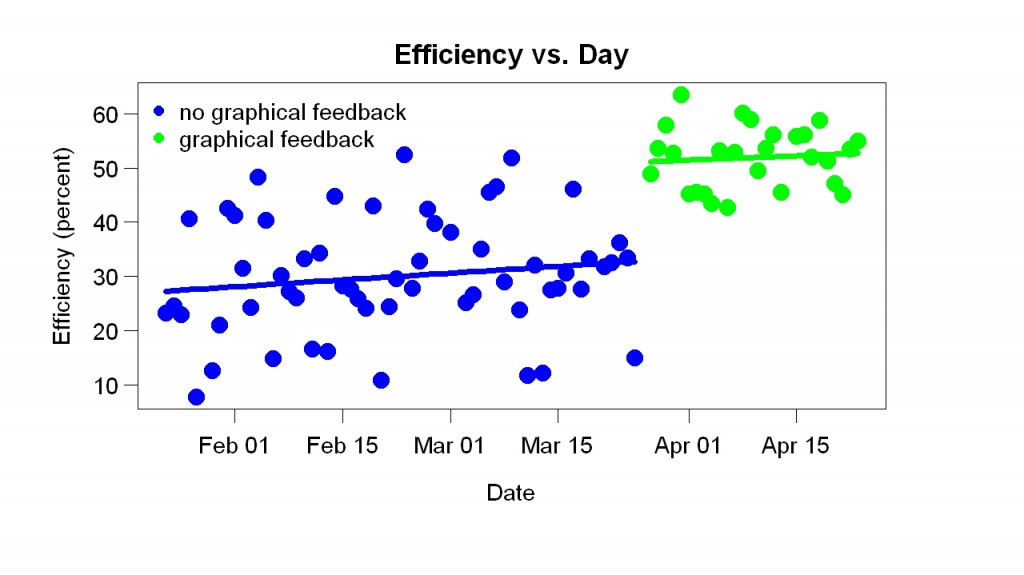
I didn’t expect this, as I’ve said. It is not “the effect of feedback”; before the graphical feedback, I’d gotten non-graphical feedback. It is a comparison of two kinds of feedback.
Why was the new feedback better? Here’s my best guess. It helped a little that it was pretty (compared to text). It helped a lot that it was in percentile form (today’s score compared to previous scores). This meant the score was almost never bad (from the beginning the percentile was was usually more than 50) and yet could always be detectably improved (e.g., from 68 to 70) with a little effort. I wish I could get such continuous percentile feedback in other areas of life – e.g., while treadmill running. I think feedback works poorly when it is discouraging or unpleasant and when it is too hard to improve. When I taught a freshman seminar at Berkeley, I got feedback (designed by a psychology professor) that was so unpleasant I stopped teaching freshman seminars. Because it came only at the end of the term, it was hard to improve — you’d have to teach the class again to get a better score. Moreover, it compared your score to everyone else’s. I think I was in the lower 50%, which I found really unpleasant. There was no easy way to give feedback about the feedback; maybe it is still in use.
In contrast, I love the feedback shown in the upper graph. Not only does it really help, as the lower graph shows, it leaves me at the end of the day with a feeling of accomplishment.


