How to Self-Experiment

At the upcoming QS Conference (May 28-9, San Jose), Robin Barooah and I will run a session about self-experimentation. Alexandra Carmichael asked me to write a post about how to do self-experimentation as a kind of advertisement for the session. Robin and I will be giving examples of what we have done and what we learned from them. Here’s some of what I’ve learned.

1. Easier to learn useful stuff than I expected. In contrast to the rest of life, where things turn out harder than expected, learning useful stuff by self-experimentation was always easier than I expected, in the sense that the benefit/cost ratio was unexpectedly high. I learned useful things I never expected to learn. An example is acne. When I was a grad student I had acne. My dermatologist had prescribed two drugs, tetracycline and benzoyl peroxide. I believed that the tetracycline worked and the benzoyl peroxide did not work. My results showed the opposite. It hadn’t occurred to me that I could be so wrong, nor that my dermatologist could be wrong (he believed both worked), nor that the establishment view (treat acne with tetracycline) could so easily be shown to be wrong.

2. Don’t be afraid of subjective measurements. By subjective measurements I mean non-physical measurements, such as ratings of mood or how rested I felt — what professional researchers call “self-report”. They routinely say self-report is misleading. At first, I wondered if my expectations and hopes would distort the measurements. As far as I can tell, that didn’t happen. Instead, I found such measurements helped me learn plenty of useful stuff I couldn’t have learned without it. For example, I learned how to improve my mood and how to wake up more rested.

3. Complex experimental designs were rarely worth the extra effort. Now and then I tried relatively complex experimental designs (e.g., randomization, a factorial experiment). Usually they were too hard.

4. Run conditions until you get 5-40 days of flat results (flat = what you are measuring is not going up or down). Ideal is 10-20 days. Suppose I want to compare Treatments A and B (e.g., different amounts of butter). I decide to make one measurement/day. The first step would be to do A for several days. I keep doing A until whatever I am measuring (e.g., sleep) stops steadily increasing or decreasing and then run several more days — ideally, 10-20. Then I do B for several days. I keep doing B until my measurement stops changing, then I do 10-20 more days of B. If the B measurements looked different from the A measurements, I would then return to Treatment A. It’s always a good idea to run a treatment until your central measurement stops changing, and then run it longer. How much longer? I’ve found that less than 5 days makes me nervous. Whereas running a condition for more than 40 days of flat results is a wasted opportunity to learn more by trying a different treatment.

5. Data analysis is easy. The most important thing is to plot measurement versus day. It will tell you most of what you want to know. For example, most of the graphs in this paper show whatever I was measuring (sleep, weight, etc.) as a function of day.

6. When you add data, look again at all the data. Each time I collect new data, I plot all of the data, or at least a large chunk of it. This helps spot unexpected changes. For example, each time I measure my weight I look at a plot of my weight over the last year or so. Recently I found that cold showers caused me to gain weight, which I hadn’t expected. If I hadn’t looked at a year of data every time I weighed myself, it would have taken longer to notice this.

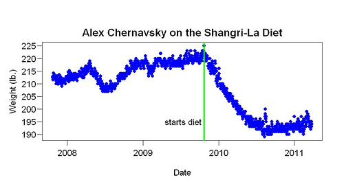
7. Don’t adjust your set. My conclusions often contradicted expert opinion. Again and again, however, other data suggested my self-experimental conclusions were correct. Acne is one example. Later research supported my conclusion that tetracycline didn’t work. Another example is breakfast. Experts say breakfast is “the most important meal of the day.” I found it caused me to wake up too early. When I stopped eating it, my sleep got better. Other data supported my conclusion. The Shangri-La Diet is a third example. According to experts, it should never work. Hundreds of stories show it works at least some of time.

The most useful lesson I learned was the most basic. You will be tempted to do something complicated. Don’t. Do the simplest easiest thing that will tell you something. The world was always more complicated than I realized. Eventually it sank in: Complicated (experiment) plus complicated (world) = confusion. Simple (experiment) plus complicated (world) = progress.

Why Did Graphical Feedback Improve My Work Habits?

A few days ago I posted about the effect of efficiency graphs — graphs of time spent working/available time vs time of day (see below for an example). I used these graphs as feedback. They made it easy to see how my current efficiency compared to past days. As soon as I started looking at them (many times/day), my efficiency increased from about 25% to about 40%. I was surprised, you could even say shocked. Sure, I wanted to be more efficient but I had collected the data to test a quite different idea. In this post I will speculate about why the efficiency graphs helped.

Commenting on my post, a reader named Wayne suggested they helped for two reasons:

1. Motivation: You basically turned it into a contest with yourself by phrasing it as “today compared to previous days”. . .

2. Concreteness. . . . You were originally working with data in abstraction: what does “good” or “better” really mean, in realistic terms? . . . [Now] you can focus on the much more concrete: “am I doing better than in the past?”

This is a good guess. Before the graphical feedback, I had gotten plenty of non-graphical feedback: (a) how many minutes worked so far that day and (b) how many minutes during the current bout of work. Naturally I compared these numbers to previous days — certain total minutes per day and certain bout lengths were good, others were bad (e.g., working only 20 minutes before taking a break was bad, working 50 minutes before a break was good) — but I barely corrected for time of day. I vaguely knew that a certain amount by noon was good, for example. In other words, I did compare present to past, but vaguely.

Why were the efficiency graphs better than the text feedback? In addition to Wayne’s suggestions, I can think of other possible reasons:

1. Small improvements rewarded. When I was working, the line went up. Seeing this I thought good! — that is, I was rewarded. A good thing about this scheme is that it rewarded small improvements. A reward system that dispenses plenty of rewards (at the right times) will work better than a system that dispenses few of them.

2. Realistic goals. The goal — doing better than in the past — wasn’t hard to reach because the feedback was based on the whole previous distribution. I felt good if I was doing better than the median and even better the further from the median I was. This is more realistic than, say, dispensing reward only if I do better than ever before.

3. Pretty. The graphs are more attractive than a line of print (“40 minutes worked so far, 120 minutes so far today”) so I looked at them more often. Any feedback mechanism will work better if you pay more attention to it.

4. Loss aversion. Looking at the graphs caused a low-level pressure to work when I wasn’t working because I imagined the line going down. With previous feedback, loss was less obvious. With the previous feedback, if I didn’t work, minutes worked just didn’t increase; it did not go down.

5. Gentle pressure. When I didn’t work, my efficiency score went down slowly because it was based on the whole previous day, not just the last 10 minutes. This made the whole thing more sustainable.

In hope of rewarding even smaller improvements, I added a number to the graph: the percentile of the current efficiency score to efficiency scores near the same time of day. Here is an example.

2011-04-04 more feedback

Each point is the start or end of a bout of work. Blue points = before graphical feedback, green points afterwards. The red and black points are the final points of the days. The brown line is the current day.

The large 77 in the upper right corner means 77th percentile, which means that the current efficiency score (shown by the end of the brown line) is in the 77th percentile compared to efficiencies measured within an hour of the same time of day. Let’s say the time was 9 pm. Then this percentile was computed using all scores (all the dots) between 8 and 10 pm. 77th percentile means that about 23% of the surrounding scores were higher, 77% lower.

The reason for this change is to make the feedback even more graded and realistic — even more sensitive to small improvements that are possible to make. My theory of human evolution says that art and decoration evolved because tools did a poor job of rewarding improvement. Until you could make the most primitive example of a tool, there was no reward for increased knowledge. The reward-vs.-knowledge function was close to a step function. Desire for art and decoration provided a more gradual reward-vs.-knowledge function. (I just finished a new write-up of that theory, which I will post soon.) . That’s what I am trying to do here.

Dangers of Antibiotics: Case Study

A column in The Telegraph by a doctor named James Le Fanu describes the following case:

It started eight years ago when he was laid low, while on holiday in Sri Lanka, by diarrhea. His symptoms cleared with antibiotics but he was left with a churning gut and frequent loud belching. This carried on for a couple of years until, listening to Farming Today, he heard an Australian vet talking about his belching sheep. “I got in touch and explained that I seemed to be behaving like one of his flock,” he writes. The vet suggested his bowel infection might have interfered with the gut enzymes for metabolising sugars, causing him to be intolerant of fructose. A test dose of orange juice immediately brought on his symptoms, and his gut problems settled on reducing his sugar intake.

In other words, no one consulted about this case, including the Australian vet and Dr. Le Fanu, seems to have understood that (a) a large fraction of our digestion is done by bacteria and (b) antibiotics kill bacteria. If you take antibiotics you risk digestive problems. I predict the belching would have gone away had he started eating fermented foods with bacteria that digest sugar. It was certainly worth a try.


Effect of Graphical Feedback on Productivity

After talking to Matthew Cornell a few months ago, I decided to try to measure how much time I worked. Measuring it might help me control it. I’d done this before but hadn’t gotten anywhere. Maybe this time . . .

I used R. It was easy to record when I worked. I work a while (e.g., 60 minutes), take a break (e.g., 30 minutes), go back to work, take another break, go back to work, take another break, and so on. The R programs I wrote recorded when each bout of work started and stopped. A typical day might have six bouts of work, interspersed with breaks. It was harder to write a program to show the data so I collected data for about eight weeks before I looked at it.

The display program I eventually wrote showed “efficiency” (total time spent working that day/available time that day) as a function of time of day. Each bout of work generated two points on the graph: one when it started, one when it ended. For each point, the efficiency of the whole day up to that point was computed. For example, if a bout of work started at 10 am, the efficiency for that time was how much work I had done before 10 am divided by how much time I had available before 10 am. Time available was computed from 3 am or when I woke up, whichever was later — as amusing/horrifying as that might sound. Suppose I woke up at 5 am. At 10 am, then, I had had 5 hours available to work. Suppose I had only worked between 8 am and 9 am. Then total work up to that point = 1 hour and efficiency = 20% (= 1/5). So I plot a point at (10 am, 20%). Suppose I work for an hour. End point: 11 am. Total work up to that point: 2 hours. Efficiency: 33% (= 2/6). That’s a point at (11 am, 33%).

Although I had collected the data to test an idea, I also thought it would be interesting to see how the current day compares to previous days. Was I doing better than usual? Worse than usual? To make this comparison I plotted the data from the current day as a line rather than as points, to make it stand out. I also made it a different color. I often ran the display program while working. It showed the results up to that moment.

All this had a surprising result: I became considerably more efficient. Here is an example of the graphs I looked at many times per day:

The brown line is the current day. The line goes up when I work, down during a break, up again when I resume working. Blue and green points are previous days. Blue points are from the days before I started looking at graphs like this, green points from the days after I started looking at graphs like this. In other words, the difference between the green and blue points shows the effect of looking at graphs like this. The red and black points are the final points of the day — red from the days before feedback, black from the days after feedback began. They summarize the day. The higher they are, the more efficient I was.

The green points are mostly above the blue points — and, especially, the black points are above the red points. This suggests that the graphical feedback made me more efficient. Before it began, I was about 25% efficient throughout the day. After this feedback began, I was about 40% efficient. The only change was addition of this feedback.

I was shocked by these results — the improvement was sudden and large. Had I an inkling that such a thing was possible, I would have tried it long ago. The comparison isn’t feedback vs. no feedback. Before the graphical feedback started I got printed feedback (“120 minutes [work] so far”) as often as I wanted and whenever I started or stopped work. And I’ve kept records of how much I work in other ways for a long time. My professional research area is animal learning — not far from studying the effect of feedback.

If the improvement persists, I will try to explain it. I once spoke to an engineering professor who started measuring his calorie intake, hoping to lose weight. As soon as he started keeping track, his once-a-week binges of eating a whole carton of ice cream in a sitting stopped. That’s the closest result I can think of and it isn’t that close.


Assorted Links

  • Interview with Peter Pronovost. “The pilot who neglects a checklist before take-off would not be allowed to fly, and most safe industries have transgressions that are firing offenses. … There hasn’t been that kind of accountability in health care. … Hospitals don’t pressure physicians about teamwork for fear of jeopardizing the business they bring to the hospital.”
  • Doctors taking kickbacks. Dr. William H. Resh, one of the accused doctors, defended himself like this: “I believe that it goes without saying that a doctor who agrees to consult with a company does so because of the confidence level they have in the company and the quality of its products.”
  • Advanced navel-gazing — nice article in Forbes about self-tracking.

Thanks to Brent Pottenger.

The Growth of Paleo: Patrick Vlaskovits Interview

I wondered if Patrick Vlaskovits, who runs the question-answer site PaleoHacks, could shed some light on the recent growth of interest in a Paleo approach to health. So I asked him a few questions.

SETH What have you learned from PaleoHacks about the growth of the Paleo movement during the last year?

PATRICK Well, one thing is certain … the Paleo movement IS growing. One can look at various proxies for this — Google Trends – for example – https://www.google.com/trends?q=paleo+diet — or more frequent mentions in the mainstream media. But your question is about what I have learned from PaleoHacks.com with regard to growth. PaleoHacks.com’s traffic is definitely growing and my sense is that Paleo (by that I mean eating in an evolutionarily appropriate manner) is about to cross the chasm into the mainstream.

A few interesting measures of growth vis-a-vis PaleoHacks are:

1) The increasing frequency of meta-discussions on PaleoHacks –people who have been eating Paleo for some time are now looking to the future about what it means to be “Paleo” and how long-time Paleo eaters are changing their Paleo diets. This is, IMO, is a good thing as Keynes said: ”When the facts change, I change my mind — what do you do, sir?” We are learning more about how our health changes after some time eating Paleo – and what needs to be fine-tuned when it comes to things like bacterial/gut health (probably the most important thing to worry about) and hormonal changes relative to our environment, e.g. cortisol levels increasing due to lack of sleep which can result in unwanted/unhealthy weight gain or weight loss.

2) More people are blogging about Paleo and also more people are trying to monetize Paleo and I see them on PaleoHacks. (For the record, I have no problem with anyone trying to monetize Paleo as long as they are responsible about it as I feel that anyone monetizing Paleo should also be a good steward of Paleo.)

SETH How much has PaleoHacks traffic grown over the last year?

PATRICK Short answer: A lot. Longer answer: Depends on which metric you use — but still a lot. Ranges from 6x to 8x YOY increase in visits, uniques and page-views. Currently, PaleoHacks gets +500k page-views a month. [I double-checked my internal stats with public information on Compete.com & Quantcast – and it looks like they undercount (BTW this is a well-known and hotly debated topic).]

SETH What do you think is causing such fast growth? The broad idea is really old. Even the details are old — Weston Price wrote in the 1930s, for example. The Weston Price Foundation, which was started many years ago, is growing much more slowly.

PATRICK Cutting to the chase: no idea. Some thoughts:

Paleo’s growth appears highly correlated with CrossFit — but what has caused CrossFit’s growth? Not sure. It too has been around a while.

Social media have certainly accelerated/lubricated Paleo’s growth but I don’t if social media actually *caused* Paleo’s growth. What causes memes like Paleo to spark, and then die out or go dormant and then spark again to grow into a raging wildfire? I wish I knew.

Getting a little meta and perhaps off-topic — my assumption is that is true for most “Big Ideas”. We rarely recognize or know of their true “discovery” because for-whatever-reason the implications are not fully, if at all, appreciated at the time of discovery. For example, I believe this was the case with penicillin. A French medical student discovered it 1896, Fleming re-discovered it in 1928 and then it lay around until 1939 when Florey fully appreciated it.

I certainly didn’t put two and two together when I read Why We Get Sick back in 2000-ish. I thought it a fantastic book (and still do)– but I didn’t think of applying the evolutionary lens to diet/nutrition, even though in retrospect, it seems obvious.

Evolutionary Health Journal to Start

Building on the success of the Ancestral Health Symposium — it will be in August, but it’s already a success — Aaron Blaisdell is planning to start a scientific journal on the subject.

It will be an historic thing. The notion that ancient lifestyles are especially healthy has been around, and taken seriously, for at least a few hundred years. Serious data began to be gathered in the early 1900s. Weston Price is an example. For a very long time this idea seemed to go nowhere, or at least the mainstream ignored it. In the 1970s there began a small irregular stream of publications (e.g., a book called Western Diseases edited by my friend Norman Temple) but again the mainstream ignored it.

But mainstream medicine doesn’t work very well. The notion that when you get sick you should take a dangerous expensive drug doesn’t make a lot of sense. You didn’t get sick because you lacked the drug. More plausible is that when you get sick you should reverse the environmental conditions that caused the sickness and find out if your body can heal itself. Even more, you should prevent disease from starting. Along with mainstream medicine’s implausible intellectual foundation has come pathetic results. Robin Hanson has emphasized the RAND experiment that found that a large fraction of medical spending produced little benefit. Tyler Cowen has pointed out that Americans spend far more than other countries on health care with no better results. A doctor at a county hospital once told me, “The truth is that we can’t help most people that come in.” They come in with diabetes, obesity, and so on. Why don’t you do something that does help? I asked. Because when you do prevention research, she said, you don’t get people thanking you. She was describing a protection racket: make people sick — if only by failing to tell them how to be healthy — so that they will come to you for help.

An academic journal with a steady stream of articles and supporting evidence is a big step toward getting the paleo alternative taken seriously. It will help researchers who take paleo ideas seriously publish their work, of course, but it will also help them get feedback. Because it will help them publish, it will help them get research support. Because the journal (like any new journal) will be open access, it will help those who want to learn about those ideas. When ideas about health are forced to compete on their merits (such as cost, safety, effectiveness, and quality of the supporting evidence) and becoming an M.D. confers less of a monopoly (on information and treatment), a great change will come. Richard Nikoley recently posted an example of what a difference this can make.

1.5 Years on the Shangri-La Diet

Alex Chernavsky has kindly given me several years of weight data he collected by weighing himself daily. He read about the Shangri-La Diet in 2005 and several years later decided to try it. The graph above shows what happened: Starting at 222 pounds (BMI = 32), over 11 months he lost 31 pounds, reaching a BMI of 27. Since then — while continuing the diet — his weight has increased at roughly the same rate it was increasing before he started the diet.

He started by drinking olive oil and sugar water, switched to olive oil alone, and then, finally, to flaxseed oil alone of which he drinks 3.5 tablespoons/day (= 420 calories/day). He does not clip his nose shut when he drinks it but he washes his mouth with water afterwards. More about his method here.

Almost all weight-control experts would say these results are impossible: 1. Alex lost weight because he ate more fat. Fat is fattening say most nutrition experts. 2. Atkins dieters, who don’t say that, think the secret of weight loss is to reduce carbohydrate. Alex didn’t do that (and eats plenty of carbohydrate). 3. He didn’t restrict what he ate in any way. 4. He didn’t change how much he exercised.

Quite apart from how it contradicts mainstream beliefs, including Atkins, the data are remarkable because the change was so simple, small, and sustainable, the weight loss so large, the rebound so minimal, and data period so long.

An ordinary clinical trial has obvious advantages over such one-person data, such as more subjects and more data per subject. Less obvious are the advantages of this sort of data over clinical trials:

1. Long pre-diet baseline. Clinical trials never have this. It allows one to judge if weight increase post-diet, often called “regain”, is due to the weight loss or other factors. In this case the rising pre-diet baseline shows that other factors are causing slow weight gain over time.

2. Motivation. In a clinical trial, the motivations of the researchers and the subjects are different. The researchers want to measure the effect of an intervention; the subjects want to lose weight. If paid, they may want to make money. The difference in motivations causes problems. How closely the subjects obey the researchers and how truthful they are is usually hard to know. This data does not have that clash of motivations and incentive to lie.

3. Realism — what methodologists call ecological validity. These data, unlike clinical trial data, come from the situation to which everyone wants to generalize: people trying a diet by themselves at home without professional support or guidance.

4. Level of detail available. You (the reader) have access to something resembling raw data. In clinical trial reports, the data available is heavily filtered (e.g., shortened, simplified) and the nature of the filtering rarely described. For example, you rarely learn in any detail what the subjects ate. With this sort of data, but not clinical trial data, you can get a better sense of whether the results are likely to apply to you.

Methodological Lessons From My One-Legged-Standing Experiment

A few days ago I described an experiment that found standing on one leg improved my sleep. Four/day (= right leg twice, left leg twice) was better than three/day or two/day. I didn’t know that. For a long time I’d done two/day.
I think the results also contain more subtle lessons. At the level of raw methodology, I found that context didn’t matter. The effect of four/day was nearly the same when (a) I measured that effect using four days in a randomized design (where the dose for each day is randomly chosen from two, three, and four) and when (b) I measured that effect using a dose of four day after day. Suppose I want to compare three and four. Which design should I use: (a) 3333344444, (b) 3434343434, or (c) 4433343434 (randomized)? The results suggest it doesn’t matter.

The experiment didn’t take long (a few months) but it took me a long time to begin. I noticed the effect behind it (one-legged standing improves sleep) two years ago. Why did I wait so long to do an experiment about details?

I was already collecting the data (on paper) — writing down how long I slept, rating how rested I felt, etc. But I wasn’t entering that data in my laptop. To transfer months of data into my laptop required motivation. Most of my self-experimentation has been motivated by the possibility of big improvements — much less acne, much better mood, and so on. That wasn’t possible here. I slept well, night after night.

What broke the equilibrium of doing nothing? A growing sense of loss. I knew I was throwing away something by not doing experiments (= doing roughly the same thing day after day). The longer I did nothing, the more I lost. To say this in an extreme way: I had discovered a way to improve sleep that was unconnected to previous work — sleep experts haven’t heard of anything like it. It was real progress. To fail to figure out details was like finding a whole new place and not looking around. Moreover, the experiments wouldn’t even be difficult. The treatment takes less than a day and you measure its effect the next morning. This is much easier than lots of research. Suppose you know that radioactivity is bad and you discover something radioactive in your house. A sane person would move that radioactive thing as far away as possible — minimizing the harm it does. I had discovered something beneficial yet wasn’t trying to maximize the benefits. Crazy!

An early lesson I learned about experimentation is to run each condition much longer than might seem necessary. If you think a condition should last a week, do it for a month. Things will turn out to be more complicated than you think, having more data will help you deal with the additional complexity that turns up. Now it was clear I had gone too far in the direction of passivity. I did the experiment, it was helpful, I could have done it a year ago.

The Shangri-La Diet: Why No Revolution?

David Mandel, CEO of Alliance United Insurance Company, asks a very reasonable question:

Despite all the success stories [on the Internet] regarding the Shangri-La Diet, and the mainstream media stories in 2006 after the book publication, the diet never picked up and seems almost unknown today.

Whether this is right or wrong depends on expectations. In December, SLD got a great push from being on the website of Tim Ferriss’s Four Hour Body under the attractive title “Alternative to Dieting”. Tim’s book was published in December and registrations to the SLD forums jumped dramatically. Yet even before that, forum traffic was growing. Traffic of course grew when the SLD book came out, later shrank, and now — surprisingly — is growing again. My interpretation is that the initial growth was caused by mainstream publicity and blogs. The current growth is caused by word of mouth.

If I google “Shangri-La Diet” I get about 800,000 hits, a decent amount. “Sonoma Diet” — the book came out the same time as mine — gets 200,000 hits. “Eat Right For Your [Blood] Type” and “Eat Right 4 Your Type” get a combined 150,000 hits. That book was a huge hit when it came out in 1997. The usual pattern is Google hits go down, but SLD hits have gone up over the years.

On the other hand, given that my book contained a new theory of weight control that made about 100 times more sense than the usual ideas and led to counter-intuitive new ways to lose weight that actually worked and that obesity is often considered the world’s #1 health problem — yeah, it is “almost unknown” compared to what one might have expected.

I was wondering if you had any insight as to why it did not go viral, if nothing more from word of mouth from success stories sharing with everyone who will listen to their excitement. It seems all but impossible to me that something this simple, and universally successful which can benefit the masses has managed to not go mainstream in all these years. I am utterly baffled, and assumed there must be a big downside, but all my searching online has revealed nothing but the success stories and initial feedback, mostly from 2006 and 2007, and little since. I am just overwhelmed with curiously as to how this did not become the norm for everyone.

When my agent circulated the proposal for the book, one editor regretfully declined to bid on it because she said the book was “15 years ahead of its time.” Perhaps she was just being nice, but when people tried the diet, and it worked, they wouldn’t tell other people because the diet sounded crazy. Which means it really was far ahead of its time. Good Morning America filmed me for a short Freakonomics-related segment and they played it for laughs: crazy professor.

So that’s my explanation for why it has spread more slowly than one might have expected: fear of ridicule.