Nick Winter’s Big Success with Percentile Feedback

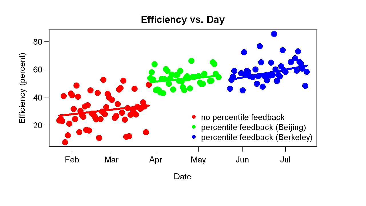
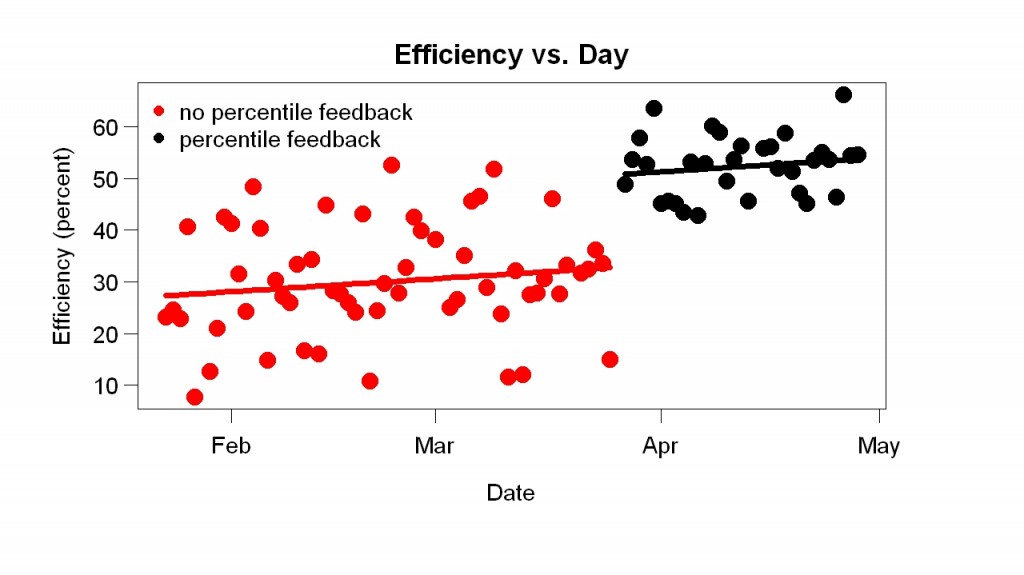
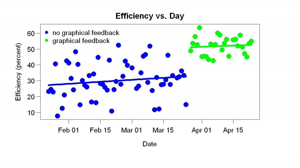
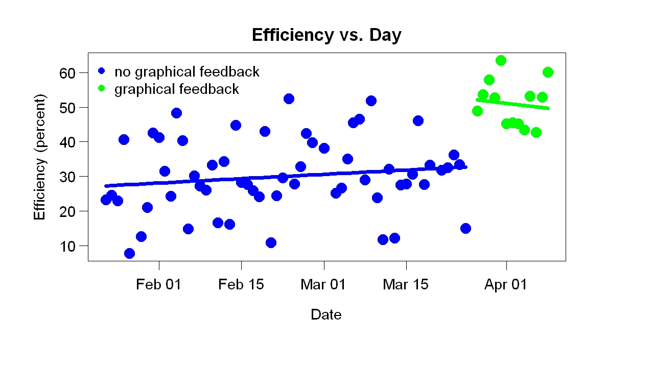
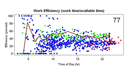
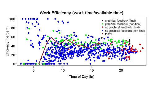
I have posted several times about using what I call percentile feedback to boost productivity. Percentile feedback means comparing your current performance to your previous performance using a percentile. If the current performance is in the middle of your previous performances, the percentile is 50, for example. Percentile feedback is easy to understand (scores above 50 are better than average) and is sensitive to small improvements — so even small improvements are rewarded. My implementation had three other helpful features: 1. It adjusted for the time I woke up to make different days more comparable. 2. It measured efficiency (time working/time available) to further improve comparability across days. 3. It was graphical. I made a graph of efficiency throughout the current day versus previous days. It greatly increased how much I worked every day.

I love it and wish I had it for everything I measure. Unlike so many feedback systems, it is realistic and encouraging. I found it worked extremely well — to my surprise, actually. It’s not so surprising I would think of it because it vaguely resembles an animal-learning procedure. (Animal learning is my area of expertise within psychology.)

Nick Winter, one of the developers of Skritter (which I use), recently started to use it. He gave a much-too-short QS talk about it in Pittsburgh a month ago. I asked him about his experience. He is as enthusiastic as I am. He wrote:

The percentile feedback has been a huge success–I’m getting way more done than I ever did, and I’m much better at prioritizing toward my main project. Seeing the graph going in real time has been much better at making me aware of what I need to do to hit high targets each day. I will do a full writeup on this, and on my self experiments, when I finish this iOS app and stop focusing so much on work. The short teaser goes something like this:
Phase 0: just tracking normal work at end of day in a Google Doc, average 2 hours a day on iOS development
Phase 1: tracking normal work and iOS dev separately in the Google Doc, average 4 hours a day on iOS development
Phase 2: using Beeminder to have better graphing and goal incentive for iOS dev, average 5 hours a day
Phase 3: first three weeks of using percentile feedback, average 6.4 hours a day
Phase 4: second three weeks of using percentile feedback, deciding to really push it based on the positive feedback from my metrics (more productivity, more happiness), average 9.4 hours a day
So now I’m getting close to averaging 70 hours of focused iOS dev a week and it feels great. In a normal work place, “time spent working” != “productivity”, but for me they’re very similar as long as my energy is good, which it almost always is now.
The surprising insight is that changing the way that I measured my work performance–from spreadsheet, to better spreadsheet, to graph, to better graph–has had such a huge impact. I have been working on maximizing work productivity for four years, ever since starting the startup, but in the last six months I’ve become radically more effective. I love the percentile feedback graph design!

You can see his implementation on his homepage.

Percentile Feedback Update

In March I discovered that looking at a graph of my productivity (for the current day, with a percentile attached) was a big help. My “efficiency” — the time spent working that day divided by the time available to work — jumped as soon as the new feedback started (as this graph shows). The percentile score, which I can get at any moment during the day, indicates how my current efficiency score ranks according to scores from previous days within one hour of the same time. For example, a score of 50 at 1 p.m. means that half of the previous days’ scores from noon to 2 p.m. were better, half worse. The time available to work starts when I get up. For example, if I got up at 4 a.m., at 6 a.m. there were 2 hours available to work. The measurement period usually stops at dinner time or in the early evening.

This graph shows the results so far. It shows efficiency scores at the end of each day. (Now and then I take a day off.) One interesting fact is I’ve kept doing it. The data collection isn’t automated; I shift to R to collect it, typing “work.start” or “work.stop” or “work.switch” when I start, stop, or switch tasks. This is the third or fourth time I’ve tried some sort of work tracking system and the first time I have persisted this long. Another interesting fact is the slow improvement, shown by the positive slopes of the fitted lines. Apparently I am slowly developing better work habits.

The behavioral engineering is more complicated than you might think. My daily activities naturally divide into three categories: 1. things I want to do but have to push myself to do. This helps with that, obviously. 2. things I don’t want to do a lot of but have to push myself away from (e.g., web surfing). 3. things I want to do and have no trouble doing. But the recording system is binary. What do I do with activities in the third category? Eventually I decided to put the short-duration examples (e.g., standing on one foot, lasts 10 minutes) in the first category (counts as work), keeping the long-duration examples (e.g., walking, might last one hour) in the second category (doesn’t count as work).

Before I started this I thought of a dozen reasons why it wouldn’t work, but it has. In line with my belief that it is better to do than to think.

Percentile Feedback Workspace Available

I have put a requested R workspace on my website so that you can download it. The percentile feedback workspace compares your productivity (time spent working/time available to work) today to previous days. When I started using it, I became more productive. Here is an introduction. Here are all posts about it.

This is not for everyone. You need R installed to use it (of course) and you’ll need to know at least a little R. You must edit a function called save.ws so that the workspace is saved in the right place. I have used it under Windows XP.

Percentile Feedback and Productivity

Warning: This post, written for the Quantified Self blog, has more repetition than usual of material in earlier posts.

In January, after talking with Matthew Cornell, I decided to measure my work habits. I typically work for a while (10-100 minutes), take a break (10-100 minutes), resume work, take another break, and so on. The breaks had many functions: lunch, dinner, walk, exercise, nap. I wanted to do experiments related to quasi-reinforcement.

I wrote R programs to record when I worked. They provided simple feedback, including how much I had worked that day (e.g., “121 minutes worked so far”) and how long the current bout of work had lasted (e.g., “20 minutes of email” — meaning the current bout of work, which was answering email , had so far lasted 20 minutes).

I collected data for two months before I wrote programs to graph the data. The first display I made (example above) showed efficiency (time spent working/time available to work) as a function of time of day. Available time started when I woke up. If I woke up at 5 am, and by 10 am had worked 3 hours, the efficiency at 10 am would be 60%. The display showed the current day as a line and previous days as points. During the day the line got longer and longer.

The blue and red points are from before the display started; the green and black points are from after the display started. The red and black points are the final points of their days — they sum up the days. A week or so after I made the display I added the big number in the upper-right corner (in the example, 65). It gives the percentile of the current efficiency compared to all the efficiency measurements within one hour of the time of day (e.g., if it is 2 p.m., the current efficiency is compared to efficiency measurements between 1 p.m. and 3 p.m. on previous days).

I started looking at the progress display often. To my great surprise, it helped a lot. It made me more efficient. You can see this in the example above because most of the green points (after the display started) are above most of the blue points (before the display). You can also see the improvement in the graph below, which shows the final efficiency of each day.

My efficiency jumped up when the display started.

Why did the display help? I call it percentile feedback because that name sums up a big reason I think it helped. The number in the corner makes the percentile explicit but simply seeing where the end of the line falls relative to the points gives an indication of the percentile. I think the graphical display helped for four reasons:

1. All improvement rewarded, no matter how small or from what level. Whenever I worked, the line went up and the percentile score improved. Many feedback schemes reward only a small range of changes of behavior. For example, suppose the feedback scheme is A+, A, A-, etc. If you go from low B- to high B-, your grade won’t change. A score of 100 was nearly impossible, so there was almost always room for improvement.

2. Overall performance judged. I could compare my percentile score to my score earlier in the day (e.g., 1 pm versus 10 am) but the score itself was a comparison to all previous days, in the sense that a score above 50 meant I was doing better than average. Thus there were two sources of reward: (a) doing better than a few hours ago and (b) doing better than previous days.

3. Attractive. I liked looking at the graphs, partly due to graphic design.

4. Likeable. You pay more attention to someone you like than someone you don’t like. The displays were curiously likable. They usually praised me, in the sense that the percentile score was usually well above 50. Except early in morning, they were calm, in the sense that they did not change quickly. If the score was 80 and I took a 2-hour break, the score might go down to 70 — still good. And, as I said earlier, every improvement was noticed and rewarded — and every non-improvement was also gently noted. It was as if the display cared.

Now that I’ve seen how helpful and pleasant feedback can be, I miss similar feedback in other areas of life. When I’m walking/running on my treadmill, I want percentile feedback comparing this workout to previous ones. When I’m studying Chinese, I want some sort of gentle comparison to the past.


Efficiency Measurement Update

Here is another example of the efficiency graphs I’ve blogged about (here, here and here). The line is the current day; it shows how well I’m doing compared to previous days. It goes up when I work, down during breaks. The number in the right corner (“77″) is the percentile of my current efficiency (at the time the graph is made) compared to measurements within one hour (e.g., a measurement at 2 pm is compared to previous measurements between 1 pm and 3 pm).

The blue points come from before I started the feedback; the green points, afterwards. The red and black points are the final points of a day (that is, at quitting time). That the green points are above the blue points suggests that the graphical feedback helped. Here is a better way of seeing the effect of the feedback.

I didn’t expect this, as I’ve said. It is not “the effect of feedback”; before the graphical feedback, I’d gotten non-graphical feedback. It is a comparison of two kinds of feedback.

Why was the new feedback better? Here’s my best guess. It helped a little that it was pretty (compared to text). It helped a lot that it was in percentile form (today’s score compared to previous scores). This meant the score was almost never bad (from the beginning the percentile was was usually more than 50) and yet could always be detectably improved (e.g., from 68 to 70) with a little effort. I wish I could get such continuous percentile feedback in other areas of life – e.g., while treadmill running. I think feedback works poorly when it is discouraging or unpleasant and when it is too hard to improve. When I taught a freshman seminar at Berkeley, I got feedback (designed by a psychology professor) that was so unpleasant I stopped teaching freshman seminars. Because it came only at the end of the term, it was hard to improve — you’d have to teach the class again to get a better score. Moreover, it compared your score to everyone else’s. I think I was in the lower 50%, which I found really unpleasant. There was no easy way to give feedback about the feedback; maybe it is still in use.

In contrast, I love the feedback shown in the upper graph. Not only does it really help, as the lower graph shows, it leaves me at the end of the day with a feeling of accomplishment.

Effect of Graphical Feedback on Productivity: Another Look

A few months ago, inspired by talking to Matthew Cornell, I started tracking when I was working. After a while I added graphical feedback like this:

The graph shows efficiency (time spent working/time available to work) versus time of day. The line shows the current day (not today, the current day when I made this graph). The higher the line, the better. When I work it goes up; when I take a break it goes down. The points are previous days. When the line is higher than the points, I am doing better than previous days. As I said in my first post, this seemed to help a lot: compare the green points (after graphical feedback) to the blue points (before graphical feedback). I blogged about possible explanations.

Here is more analysis. This graph shows efficiency versus day. Each point is the final efficiency (the efficiency after my last bout of work that day) for one day (the black and red points on the previous graph). These results suggest that the graphical feedback caused a sudden improvement, supporting the impression given by the blue/green (before/after) comparison of the earlier graph.

Before graphical feedback, the graph shows, efficiency was slowly increasing. Perhaps that was due to measuring when I was working, but I suspect it was due to the text feedback I got. I often used my tracking system to find out how long my current bout of work had lasted and how much I had worked so far that day. (For example, right now the text feedback is “15 minutes of blog, 73 minutes today”, which means I’ve spent 15 minutes writing this blog and before that worked 58 minutes on something else.)

Let me repeat what I said in another post: This was a big surprise. I collected this data for other reasons, which had nothing to do with graphical feedback. Before this project, I had made many thousands measurements of work time, but they were (a) tied to writing, not all work and (b) recorded inside the program I use for writing (Action Outline). Using R would have been slightly harder — that’s why I used Action Outline. I never studied the data, but I had the impression it helped.

You may know about the brain-damage patient H.M. His brain damage caused loss of long-term memory formation. He could remember something for a few minutes but not longer. The researcher working with him had to keep introducing herself. A pleasant side effect was that he could read the same thing again and again — a magazine article, for example — and enjoy it each time. This is like that. I am stupid enough that the results of my self-experimentation continue to surprise me (which I enjoy). You might think after many surprises I would stop being surprised — I would adjust my expectations — but somehow that doesn’t happen.

Why Did Graphical Feedback Improve My Work Habits?

A few days ago I posted about the effect of efficiency graphs — graphs of time spent working/available time vs time of day (see below for an example). I used these graphs as feedback. They made it easy to see how my current efficiency compared to past days. As soon as I started looking at them (many times/day), my efficiency increased from about 25% to about 40%. I was surprised, you could even say shocked. Sure, I wanted to be more efficient but I had collected the data to test a quite different idea. In this post I will speculate about why the efficiency graphs helped.

Commenting on my post, a reader named Wayne suggested they helped for two reasons:

1. Motivation: You basically turned it into a contest with yourself by phrasing it as “today compared to previous days”. . .

2. Concreteness. . . . You were originally working with data in abstraction: what does “good” or “better” really mean, in realistic terms? . . . [Now] you can focus on the much more concrete: “am I doing better than in the past?”

This is a good guess. Before the graphical feedback, I had gotten plenty of non-graphical feedback: (a) how many minutes worked so far that day and (b) how many minutes during the current bout of work. Naturally I compared these numbers to previous days — certain total minutes per day and certain bout lengths were good, others were bad (e.g., working only 20 minutes before taking a break was bad, working 50 minutes before a break was good) — but I barely corrected for time of day. I vaguely knew that a certain amount by noon was good, for example. In other words, I did compare present to past, but vaguely.

Why were the efficiency graphs better than the text feedback? In addition to Wayne’s suggestions, I can think of other possible reasons:

1. Small improvements rewarded. When I was working, the line went up. Seeing this I thought good! — that is, I was rewarded. A good thing about this scheme is that it rewarded small improvements. A reward system that dispenses plenty of rewards (at the right times) will work better than a system that dispenses few of them.

2. Realistic goals. The goal — doing better than in the past — wasn’t hard to reach because the feedback was based on the whole previous distribution. I felt good if I was doing better than the median and even better the further from the median I was. This is more realistic than, say, dispensing reward only if I do better than ever before.

3. Pretty. The graphs are more attractive than a line of print (“40 minutes worked so far, 120 minutes so far today”) so I looked at them more often. Any feedback mechanism will work better if you pay more attention to it.

4. Loss aversion. Looking at the graphs caused a low-level pressure to work when I wasn’t working because I imagined the line going down. With previous feedback, loss was less obvious. With the previous feedback, if I didn’t work, minutes worked just didn’t increase; it did not go down.

5. Gentle pressure. When I didn’t work, my efficiency score went down slowly because it was based on the whole previous day, not just the last 10 minutes. This made the whole thing more sustainable.

In hope of rewarding even smaller improvements, I added a number to the graph: the percentile of the current efficiency score to efficiency scores near the same time of day. Here is an example.

2011-04-04 more feedback

Each point is the start or end of a bout of work. Blue points = before graphical feedback, green points afterwards. The red and black points are the final points of the days. The brown line is the current day.

The large 77 in the upper right corner means 77th percentile, which means that the current efficiency score (shown by the end of the brown line) is in the 77th percentile compared to efficiencies measured within an hour of the same time of day. Let’s say the time was 9 pm. Then this percentile was computed using all scores (all the dots) between 8 and 10 pm. 77th percentile means that about 23% of the surrounding scores were higher, 77% lower.

The reason for this change is to make the feedback even more graded and realistic — even more sensitive to small improvements that are possible to make. My theory of human evolution says that art and decoration evolved because tools did a poor job of rewarding improvement. Until you could make the most primitive example of a tool, there was no reward for increased knowledge. The reward-vs.-knowledge function was close to a step function. Desire for art and decoration provided a more gradual reward-vs.-knowledge function. (I just finished a new write-up of that theory, which I will post soon.) . That’s what I am trying to do here.

Effect of Graphical Feedback on Productivity

After talking to Matthew Cornell a few months ago, I decided to try to measure how much time I worked. Measuring it might help me control it. I’d done this before but hadn’t gotten anywhere. Maybe this time . . .

I used R. It was easy to record when I worked. I work a while (e.g., 60 minutes), take a break (e.g., 30 minutes), go back to work, take another break, go back to work, take another break, and so on. The R programs I wrote recorded when each bout of work started and stopped. A typical day might have six bouts of work, interspersed with breaks. It was harder to write a program to show the data so I collected data for about eight weeks before I looked at it.

The display program I eventually wrote showed “efficiency” (total time spent working that day/available time that day) as a function of time of day. Each bout of work generated two points on the graph: one when it started, one when it ended. For each point, the efficiency of the whole day up to that point was computed. For example, if a bout of work started at 10 am, the efficiency for that time was how much work I had done before 10 am divided by how much time I had available before 10 am. Time available was computed from 3 am or when I woke up, whichever was later — as amusing/horrifying as that might sound. Suppose I woke up at 5 am. At 10 am, then, I had had 5 hours available to work. Suppose I had only worked between 8 am and 9 am. Then total work up to that point = 1 hour and efficiency = 20% (= 1/5). So I plot a point at (10 am, 20%). Suppose I work for an hour. End point: 11 am. Total work up to that point: 2 hours. Efficiency: 33% (= 2/6). That’s a point at (11 am, 33%).

Although I had collected the data to test an idea, I also thought it would be interesting to see how the current day compares to previous days. Was I doing better than usual? Worse than usual? To make this comparison I plotted the data from the current day as a line rather than as points, to make it stand out. I also made it a different color. I often ran the display program while working. It showed the results up to that moment.

All this had a surprising result: I became considerably more efficient. Here is an example of the graphs I looked at many times per day:

The brown line is the current day. The line goes up when I work, down during a break, up again when I resume working. Blue and green points are previous days. Blue points are from the days before I started looking at graphs like this, green points from the days after I started looking at graphs like this. In other words, the difference between the green and blue points shows the effect of looking at graphs like this. The red and black points are the final points of the day — red from the days before feedback, black from the days after feedback began. They summarize the day. The higher they are, the more efficient I was.

The green points are mostly above the blue points — and, especially, the black points are above the red points. This suggests that the graphical feedback made me more efficient. Before it began, I was about 25% efficient throughout the day. After this feedback began, I was about 40% efficient. The only change was addition of this feedback.

I was shocked by these results — the improvement was sudden and large. Had I an inkling that such a thing was possible, I would have tried it long ago. The comparison isn’t feedback vs. no feedback. Before the graphical feedback started I got printed feedback (“120 minutes [work] so far”) as often as I wanted and whenever I started or stopped work. And I’ve kept records of how much I work in other ways for a long time. My professional research area is animal learning — not far from studying the effect of feedback.

If the improvement persists, I will try to explain it. I once spoke to an engineering professor who started measuring his calorie intake, hoping to lose weight. As soon as he started keeping track, his once-a-week binges of eating a whole carton of ice cream in a sitting stopped. That’s the closest result I can think of and it isn’t that close.