After talking to Matthew Cornell a few months ago, I decided to try to measure how much time I worked. Measuring it might help me control it. I’d done this before but hadn’t gotten anywhere. Maybe this time . . .
I used R. It was easy to record when I worked. I work a while (e.g., 60 minutes), take a break (e.g., 30 minutes), go back to work, take another break, go back to work, take another break, and so on. The R programs I wrote recorded when each bout of work started and stopped. A typical day might have six bouts of work, interspersed with breaks. It was harder to write a program to show the data so I collected data for about eight weeks before I looked at it.
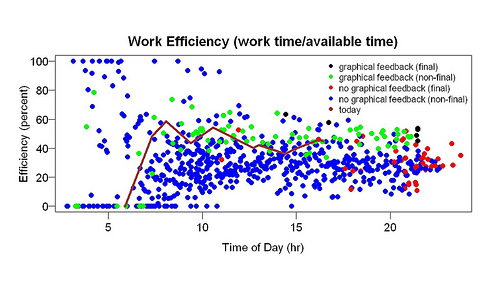
The display program I eventually wrote showed “efficiency” (total time spent working that day/available time that day) as a function of time of day. Each bout of work generated two points on the graph: one when it started, one when it ended. For each point, the efficiency of the whole day up to that point was computed. For example, if a bout of work started at 10 am, the efficiency for that time was how much work I had done before 10 am divided by how much time I had available before 10 am. Time available was computed from 3 am or when I woke up, whichever was later — as amusing/horrifying as that might sound. Suppose I woke up at 5 am. At 10 am, then, I had had 5 hours available to work. Suppose I had only worked between 8 am and 9 am. Then total work up to that point = 1 hour and efficiency = 20% (= 1/5). So I plot a point at (10 am, 20%). Suppose I work for an hour. End point: 11 am. Total work up to that point: 2 hours. Efficiency: 33% (= 2/6). That’s a point at (11 am, 33%).
Although I had collected the data to test an idea, I also thought it would be interesting to see how the current day compares to previous days. Was I doing better than usual? Worse than usual? To make this comparison I plotted the data from the current day as a line rather than as points, to make it stand out. I also made it a different color. I often ran the display program while working. It showed the results up to that moment.
All this had a surprising result: I became considerably more efficient. Here is an example of the graphs I looked at many times per day:

The brown line is the current day. The line goes up when I work, down during a break, up again when I resume working. Blue and green points are previous days. Blue points are from the days before I started looking at graphs like this, green points from the days after I started looking at graphs like this. In other words, the difference between the green and blue points shows the effect of looking at graphs like this. The red and black points are the final points of the day — red from the days before feedback, black from the days after feedback began. They summarize the day. The higher they are, the more efficient I was.
The green points are mostly above the blue points — and, especially, the black points are above the red points. This suggests that the graphical feedback made me more efficient. Before it began, I was about 25% efficient throughout the day. After this feedback began, I was about 40% efficient. The only change was addition of this feedback.
I was shocked by these results — the improvement was sudden and large. Had I an inkling that such a thing was possible, I would have tried it long ago. The comparison isn’t feedback vs. no feedback. Before the graphical feedback started I got printed feedback (“120 minutes [work] so far”) as often as I wanted and whenever I started or stopped work. And I’ve kept records of how much I work in other ways for a long time. My professional research area is animal learning — not far from studying the effect of feedback.
If the improvement persists, I will try to explain it. I once spoke to an engineering professor who started measuring his calorie intake, hoping to lose weight. As soon as he started keeping track, his once-a-week binges of eating a whole carton of ice cream in a sitting stopped. That’s the closest result I can think of and it isn’t that close.
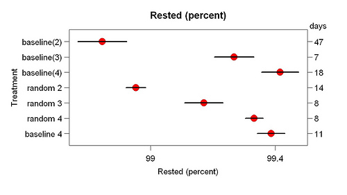
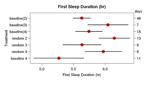
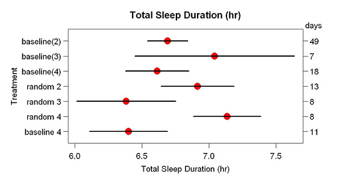
 This shows means and standard errors. The number of days in each condition are on the right.
